3D&Live Wallpaper-launcher
- 3.8
- Rating
- 10.00K
- Installs
- Free
- Price

 Analysis by App-foxy
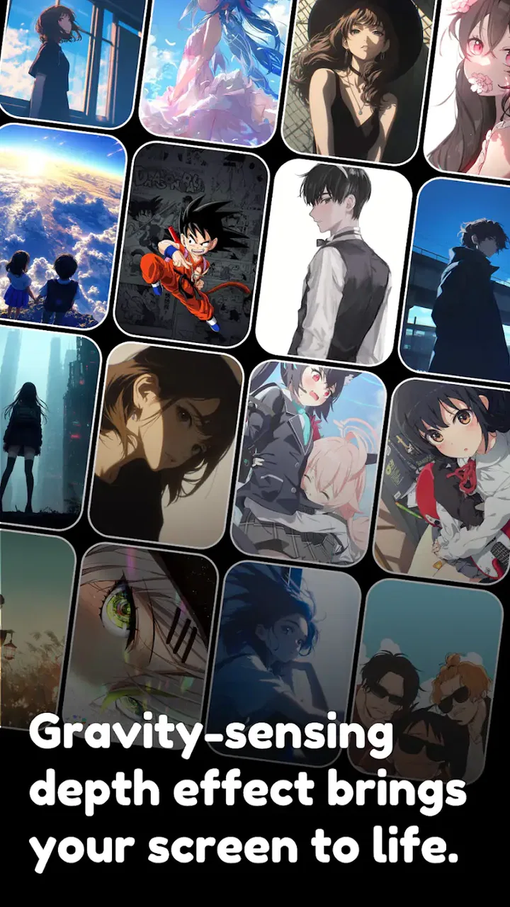
I installed 3D&Live Wallpaper-launcher expecting a quick way to make an ordinary Android home screen feel less static, and that is exactly the problem this personalization app tries to solve. Its focus is a combination of three-dimensional-looking wallpapers, animated backgrounds, launcher-style presentation, and AI-art themes. That mix makes it more interesting than a simple wallpaper picker, but it also means the experience depends heavily on how much visual movement you actually want on your phone.
My first impression was that this is best understood as a mood-setting tool rather than a complete replacement for every part of the Android interface. I can imagine using it when I am tired of the same background and want a stronger visual identity without spending time building a theme manually. At the same time, anyone who prefers a very clean, quiet home screen may find the animated approach distracting.
From a plain home screen to a finished look
The starting condition is familiar: the phone works perfectly, but the home screen feels forgettable. Static images can look good, yet they rarely change the atmosphere of the device. This app addresses that feeling with a selection centered on 3D and live wallpaper presentation, while its AI-art angle suggests a more imaginative alternative to the usual photographs, gradients, and abstract patterns.
You May Also Like

 AccuWeather: Weather Radar
AccuWeather Review: A Quick, Clear Forecast for Everyday Decisions
For everyday plans, the best forecast is the one you can understand quickly. AccuWeather makes rain timing, radar, and local conditions easy to act on, with a few trade-offs.

 Hill Climb Racing
Why Hill Climb Racing Still Turns Crashes Into One More Run
A tiny car, a bumpy hill and one more upgrade: Hill Climb Racing keeps resurfacing because its simple chaos makes every near-miss feel personal.

 AliExpress - Shopping App
AliExpress Makes Global Shopping Feel Personal, but Shoppers Bear the Risk
AliExpress turns a global marketplace into a pocket-sized discovery engine. Its reach is useful, its shopping loop compelling, and its trade-offs easy to miss.

 Lords Mobile: Kingdom Wars
Lords Mobile Is a Kingdom-Building Routine, Not a Quick Match
A case-by-case verdict on the building, battles, device demands, and social commitments that make Lords Mobile rewarding for some players and exhausting for others.

 PDF Scanner app - TapScanner
TapScanner Makes Paperwork Easier to Capture, Check, and Share
TapScanner makes scanning with a phone feel less like a rescue operation and more like a dependable step in getting work done. Its capture tools are useful, though not flawless.

 Block Blast!
 Shows How Much a Puzzle Game Can Leave Out
A quiet grid game shows why puzzle players increasingly value instant clarity, repeatable skill and low-pressure play—and where the genre still needs to catch up.
More From Our News Desk
View All News

I found the appeal strongest when I treated the app as part of a short visual workflow. Instead of opening it with a vague goal such as “find something nice,” I would first decide what I wanted the phone to feel like: calm, futuristic, colorful, dark, or playful. That small decision matters because animated wallpaper can quickly become overwhelming when the image, icons, widgets, and notifications are all competing for attention.
The app is free, which lowers the barrier to trying different looks. It is listed for a Teen audience, so I would still recommend that younger users and families pay attention to the visual material before settling on a theme. The developer behind it is BenAPPmar, and the current release is version 103, compatible with Android 8.0 and later. Those details make it accessible to people using older Android phones as well as newer devices.
Choosing a theme with the rest of the screen in mind
The most useful habit I developed was to judge a wallpaper together with the icons, clock, widgets, and notification area rather than viewing the artwork by itself. A dramatic image can look impressive in a preview and become difficult to use once app labels sit over it. For a daily phone, I prefer darker edges or calmer areas behind the icons, leaving the more detailed part of the artwork away from the main touch targets.
This is also where the three-dimensional style has a practical trade-off. Depth and motion can make the screen feel more alive, but they may reduce legibility. If I am checking a message while walking or unlocking the phone in bright light, I value contrast more than visual spectacle. I would therefore reserve the busier themes for a secondary device, a personal phone used mostly at home, or a short-term change rather than a permanent setup.
The AI-art direction is useful for people who want something less predictable than a standard wallpaper library. It can make the selection feel more expressive, especially if you enjoy unusual color combinations or fantasy-like scenes. However, the artistic style should not be confused with customization of every interface element. The main benefit is the background and overall visual mood; users seeking detailed icon-pack control, elaborate widgets, or a fully modular launcher may still prefer a dedicated launcher and separate customization tools.
The practical setup flow
My recommended process is simple. First, browse with the phone’s daily use in mind instead of choosing the most eye-catching preview. Second, check whether important labels remain readable. Third, apply the selected look and spend a few minutes opening the apps you use most. That last step is easy to skip, but it reveals whether movement or contrast creates friction during normal use.
I would also test the home screen at different times of day. A wallpaper that feels balanced indoors may look too bright outdoors, while a dark design can hide icons in a dim room. This is a more reliable test than deciding from a single preview screen. The goal is not merely to create a screenshot-worthy home screen; it is to make repeated unlocking and app launching comfortable.
One non-obvious advantage of this workflow is that it exposes visual clutter before it becomes annoying. If the wallpaper contains strong lines behind the dock or a bright subject directly beneath the clock, I know immediately that the problem is not the artwork alone. Moving a widget, reducing the number of visible icons, or selecting a quieter theme can produce a better result than repeatedly searching for a “perfect” image.
Another useful approach is to match motion to how often you unlock the phone. Someone who checks the device dozens of times during work may prefer subtle movement, because constant animation becomes background noise. Someone who uses the phone less frequently may appreciate a more dramatic transition each time the screen appears. The app is more successful when the choice reflects that routine instead of following a trend.
Where the launcher idea fits
The launcher wording gives the experience a broader feel than a wallpaper-only utility. In practice, I would approach it as a visual layer around the home-screen experience rather than assume it will replace every launcher feature I already use. Android users often have different expectations here: some want only a new background, while others expect gesture controls, app organization, icon changes, search, and widget management.
That distinction is important before making it part of a daily setup. If your current launcher already handles folders, gestures, and widgets exactly as you like, a wallpaper-focused change may be enough. If you are hoping for a complete home-screen overhaul, compare the result with a well-established launcher before reorganizing everything. A dedicated launcher generally offers deeper control over layout and behavior, while this app’s strongest identity is its visual treatment.
I would keep the first handoff deliberately small: select a theme, apply it, and leave the existing app arrangement alone. This makes it easy to judge the artwork without confusing it with a full layout change. After living with the result for a while, I could then decide whether the launcher side adds value or whether I only wanted the animated background.
A realistic everyday scenario
Imagine finishing work and wanting your personal phone to feel separate from the device you use during the day. I would open the app, choose a darker AI-art theme with enough empty space for icons, apply it, and check the home screen while launching messaging, maps, music, and the camera. If those shortcuts remain easy to identify, the new look has succeeded without requiring a complete reorganization.
For a student, the same workflow could work differently. A vivid theme may be enjoyable between classes, but a busy animated background behind a calendar and study widgets could make the screen harder to scan. In that case, I would choose a restrained design for the main page and keep the more expressive style for a secondary page, if the existing home-screen arrangement supports that comfortably.
For a family phone, I would prioritize readability and predictable access over novelty. The Teen content rating is worth keeping in mind when selecting visual material for a shared device. A free app is easy to experiment with, but “free” does not automatically mean every theme will suit every person in the household.
The handoff from preview to daily use
The biggest handoff happens when a polished preview becomes the background behind real icons and notifications. This is where I judge the app more critically. A theme needs to survive interruptions, not just look attractive when the screen is empty. Incoming notifications, a low-brightness setting, and a crowded first page can all change the impression.
I also pay attention to whether I can return to a familiar appearance without losing my normal routine. Before experimenting, I would note the existing wallpaper and avoid changing several home-screen elements at once. That creates a clean comparison: if the phone feels better, I know the visual change helped; if it feels worse, I can reverse the change without rebuilding the entire setup.
This cautious approach is especially useful for people who switch between work and personal contexts. A bold animated theme may be welcome after hours but inappropriate during a presentation or a focused work session. In that situation, the app works best as an occasional refresh rather than a permanent setting. The value comes from making the change easy enough to try, not from forcing one look on every occasion.
What the finished result feels like
When the theme is chosen carefully, the result is more noticeable than changing a normal still image. The screen gains depth and personality, and the AI-art direction can make the device feel less generic. I like that this kind of change can refresh a familiar phone without requiring new hardware or a complicated customization project.
The strongest result is not necessarily the most animated one. For my daily use, the successful themes are those that create movement or atmosphere while leaving enough visual breathing room for the interface. A wallpaper that looks slightly less spectacular but keeps the clock, icons, and notifications clear is more satisfying over time than a dazzling design I want to replace after a day.
The app’s reception is fairly mixed but positive enough to show that it has found an audience: it holds a 3.8 average from around fifty ratings and has more than ten thousand installs. I read that as a reason to approach it with realistic expectations. It is established enough to try, yet not something I would assume will match every Android setup equally well.
Version 103 suggests that the app is being maintained as an evolving product, but I would still judge it by the experience on my own device. Android phones differ in screen size, launcher behavior, and performance characteristics. A theme that feels smooth and balanced on one model may not deliver the same impression elsewhere, so the short trial workflow is more valuable than relying on the preview alone.
Where the flow breaks down
The first weak point is visual overload. Three-dimensional effects and live movement can compete with the information I actually need from the home screen. If you unlock your phone mainly to read a calendar, find an app, or check a notification, a calmer wallpaper may be the better choice. In that situation, a static wallpaper app or the built-in Android picker can be more practical.
The second issue is the gap between a wallpaper experience and a full launcher replacement. People who expect extensive gesture settings, detailed icon control, advanced folder behavior, or highly structured widget tools should not choose this app solely because the word “launcher” sounds comprehensive. A dedicated launcher is usually the better route for deep layout and navigation customization.
The third friction point is the time needed to evaluate a theme properly. Browsing can be quick, but deciding whether an animated design works with your actual icons and widgets takes longer. That is not a serious flaw, yet it means the app rewards deliberate selection rather than impulse. If you want a one-tap, invisible change, the extra visual ambition may feel unnecessary.
Battery and performance are also sensible considerations whenever live wallpaper is involved. I would watch how the phone behaves during a normal day instead of assuming the effect is free from trade-offs. If the device is older, already busy, or sensitive to background activity, a still image is the safer option. The Android 8.0 minimum makes the app broadly reachable, but compatibility does not guarantee an identical experience across all hardware.
I would also skip it if my priority is a completely uniform system theme. This app can change the feeling of the home screen, but a person seeking coordinated settings pages, notification styling, icon shapes, and app-specific visual rules may need a more comprehensive customization setup. The app is most convincing when the desired outcome is an expressive background-led refresh.
Who should try it
I recommend 3D&Live Wallpaper-launcher to Android users who enjoy changing their phone’s atmosphere and want more character than a standard photo provides. It is particularly suitable for someone who likes AI-inspired artwork, accepts a little motion, and is willing to check readability before committing to a theme.
I would be more cautious recommending it to people who prefer minimalist screens, rely on dense widgets, or need a launcher with extensive behavior controls. For those users, a dedicated launcher paired with a carefully chosen static wallpaper may deliver a cleaner and more predictable result. The app’s free price makes experimentation easy, but the right decision still depends on whether animation improves your routine or merely decorates it.
My best advice is to start with one theme and preserve your existing layout. Test the clock, dock, folders, and most-used apps, then use the phone normally rather than judging only the preview. If the result remains readable and enjoyable after repeated unlocks, the app has done its job. If you find yourself fighting the background to read the screen, choose a calmer design or return to a conventional wallpaper.
Overall, I see this as a focused personalization tool with an appealing visual idea and a few important boundaries. It can turn a plain home screen into something more distinctive, especially for users who enjoy 3D effects and AI-art aesthetics. Its success depends less on selecting the most dramatic theme and more on matching the artwork to the way you actually use your phone. The best outcome is a home screen that feels personal without getting in the way.
FAQs for 3D&Live Wallpaper-launcher
01What features does the 3D&Live Wallpaper-launcher app offer?
The 3D&Live Wallpaper-launcher app offers a wide array of dynamic wallpapers, including 3D, animated, and live options. It provides customization tools to tweak wallpapers according to your preferences. The app also integrates with various launcher features, allowing for seamless transition and interaction, enhancing the overall visual and functional experience on your device.
02Is the 3D&Live Wallpaper-launcher app compatible with my device?
The app is compatible with most Android and iOS devices. However, for optimal performance, it's recommended to use it on devices with higher processing power and RAM. Older devices might experience lag or reduced functionality. Always check the app's compatibility requirements on the download page to ensure it will work smoothly on your device.
03Does using 3D and live wallpapers affect battery life?
Yes, using 3D and live wallpapers can impact battery life, as they require more processing power to render animations and effects. To mitigate this, the app offers settings to adjust performance and reduce battery consumption. Users can choose to pause animations when the device is inactive or select less resource-intensive wallpapers to preserve battery life.
04Are there any in-app purchases or ads in the 3D&Live Wallpaper-launcher app?
The app is free to download but includes in-app purchases for premium wallpapers and additional features. It also contains ads, which can be removed by purchasing a subscription. This supports the developers and unlocks a wider range of customization options, ensuring a more personalized and ad-free experience.
05How often are new wallpapers added to the 3D&Live Wallpaper-launcher app?
New wallpapers are typically added on a weekly basis, providing users with fresh content to keep their device screens exciting. The app developers frequently update the library with seasonal themes, trending designs, and user-requested features, ensuring there's always something new to explore and customize your device with.
Pros
- Stunning high-resolution wallpapers.
- Smooth interface with easy navigation.
- Customizable themes and icons.
- Low battery consumption mode.
- Regular updates with new content.
Cons
- Ads can be intrusive at times.
- Limited free content options.
- Requires internet for full functionality.
- Some live wallpapers drain battery fast.
- In-app purchases can be pricey.

3D&Live Wallpaper-launcher
Gallery